Code
# Import packages
import numpy as np
import pandas as pd
import pytimetk as tkThis guide covers how to use the plot_timeseries() for data visualization. Once you understand how it works, you can apply explore time series data easier than ever.
This tutorial focuses on, plot_timeseries(), a workhorse time-series plotting function that:
Run the following code to setup for this tutorial.
# Import packages
import numpy as np
import pandas as pd
import pytimetk as tkThe main function is plot_timeseries(). We’ll cover some key functionality for easy time series visualization for single and grouped time series.
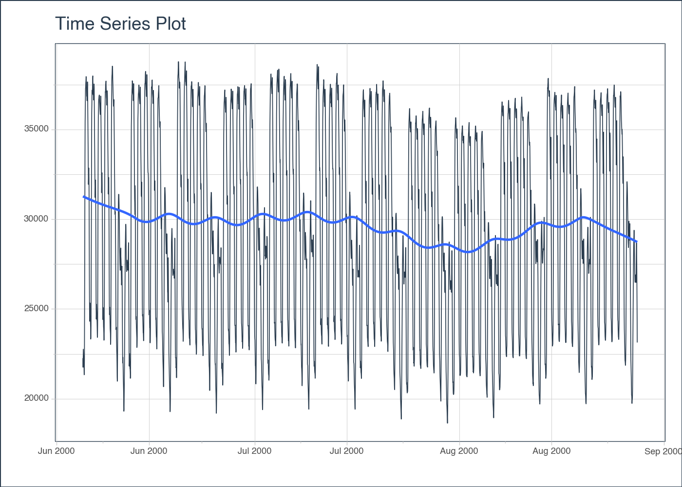
Let’s start with a popular time series, taylor_30_min, which includes energy demand in megawatts at a sampling interval of 30-minutes. This is a single time series.
# Import a Time Series Data Set
taylor_30_min = tk.load_dataset("taylor_30_min", parse_dates = ['date'])
taylor_30_min| date | value | |
|---|---|---|
| 0 | 2000-06-05 00:00:00+00:00 | 22262 |
| 1 | 2000-06-05 00:30:00+00:00 | 21756 |
| 2 | 2000-06-05 01:00:00+00:00 | 22247 |
| 3 | 2000-06-05 01:30:00+00:00 | 22759 |
| 4 | 2000-06-05 02:00:00+00:00 | 22549 |
| ... | ... | ... |
| 4027 | 2000-08-27 21:30:00+00:00 | 27946 |
| 4028 | 2000-08-27 22:00:00+00:00 | 27133 |
| 4029 | 2000-08-27 22:30:00+00:00 | 25996 |
| 4030 | 2000-08-27 23:00:00+00:00 | 24610 |
| 4031 | 2000-08-27 23:30:00+00:00 | 23132 |
4032 rows × 2 columns
The plot_timeseries() function generates an interactive plotly chart by default.
Interactive plot
taylor_30_min.plot_timeseries('date', 'value')Static plot
taylor_30_min.plot_timeseries(
    'date', 'value',
     engine = 'plotnine'
)
<Figure Size: (700 x 500)>Next, let’s move on to a dataset with time series groups, m4_monthly, which is a sample of 4 time series from the M4 competition that are sampled at a monthly frequency.
# Import a Time Series Data Set
m4_monthly = tk.load_dataset("m4_monthly", parse_dates = ['date'])
m4_monthly| id | date | value | |
|---|---|---|---|
| 0 | M1 | 1976-06-01 | 8000 |
| 1 | M1 | 1976-07-01 | 8350 |
| 2 | M1 | 1976-08-01 | 8570 |
| 3 | M1 | 1976-09-01 | 7700 |
| 4 | M1 | 1976-10-01 | 7080 |
| ... | ... | ... | ... |
| 1569 | M1000 | 2015-02-01 | 880 |
| 1570 | M1000 | 2015-03-01 | 800 |
| 1571 | M1000 | 2015-04-01 | 1140 |
| 1572 | M1000 | 2015-05-01 | 970 |
| 1573 | M1000 | 2015-06-01 | 1430 |
1574 rows × 3 columns
Visualizing grouped data is as simple as grouping the data set with groupby() before run it into the plot_timeseries() function. There are 2 methods:
This is great to see all time series in one plot. Here are the key points:
groupby().facet_ncol = 2 returns a 2-column faceted plot.facet_scales = "free" allows the x and y-axes of each plot to scale independently of the other plots.m4_monthly.groupby('id').plot_timeseries(
'date', 'value',
facet_ncol = 2,
facet_scales = "free"
)Sometimes you have many groups and would prefer to see one plot per group. This can be accomplished with plotly_dropdown. You can adjust the x and y position as follows:
m4_monthly.groupby('id').plot_timeseries(
    'date', 'value',
    plotly_dropdown=True,
    plotly_dropdown_x=0,
    plotly_dropdown_y=1
)
The groups can also be vizualized in the same plot using color_column paramenter. Let’s come back to taylor_30_min dataframe.
# load data
taylor_30_min = tk.load_dataset("taylor_30_min", parse_dates = ['date'])

# extract the month using pandas
taylor_30_min['month'] = pd.to_datetime(taylor_30_min['date']).dt.month

# plot groups
taylor_30_min.plot_timeseries(
    'date', 'value',
    color_column = 'month'
)Once you are comfortable with the core line charts, pytimetk also ships higher-level Plotly helpers that uncover seasonality, trends, and distribution shifts without hand-writing subplot logic.
plot_stl_diagnostics)Use STL to break a series into observed, seasonal, trend, remainder, and seasonally adjusted components. Faceting on an additional column (such as month) makes it easy to compare patterns side-by-side.
stl_fig = tk.plot_stl_diagnostics(
    data=taylor_30_min,
    date_column="date",
    value_column="value",
    facet_vars="month",
    facet_ncols=3,
    plotly_dropdown=True,
)
stl_figplot_seasonal_diagnostics)For categorical seasonality (hour-of-day, weekday labels, etc.), plot_seasonal_diagnostics() summarizes the value distribution for each seasonal feature. The output pairs nicely with tooltips and dropdowns when you set plotly_dropdown=True.
seasonal_fig = tk.plot_seasonal_diagnostics(
    data=taylor_30_min,
    date_column="date",
    value_column="value",
    feature_set=["hour", "wday.lbl", "month.lbl"],
    plotly_dropdown=True,
)
seasonal_figplot_time_series_boxplot)Need to understand the distribution of values within rolling periods (days, weeks, months)? plot_time_series_boxplot() aggregates each period into a box-and-whisker view, optionally overlaying a smoother.
boxplot_fig = tk.plot_time_series_boxplot(
    data=taylor_30_min,
    date_column="date",
    value_column="value",
    period="1D",
    color_column="month",
    smooth_func="median",
    smooth_color="#18BC9C",
)
boxplot_figThe anomaly plotting helpers sit on top of tk.anomalize(), so you can go from detection to diagnostics with only a few lines of code. Below we use the bike sales daily dataset and group by product category to illustrate a multi-series workflow.
bike_sales = (
    tk.load_dataset("bike_sales_sample", parse_dates=["order_date"])
    .groupby(["category_1", "order_date"], as_index=False, observed=True)
    .agg(total_price=("total_price", "sum"))
)

anomalize_df = (
    bike_sales
    .groupby("category_1")
    .anomalize(
        date_column="order_date",
        value_column="total_price",
        method="twitter",
        iqr_alpha=0.10,
        clean_alpha=0.75,
        clean="min_max",
    )
)
Plot detected anomalies with ribbons for the expected bounds:
anomaly_fig = (
    anomalize_df
    .groupby("category_1")
    .plot_anomalies(
        date_column="order_date",
        plotly_dropdown=True,
        plotly_dropdown_x=1.02,
        plotly_dropdown_y=1.12,
    )
)
anomaly_fig
Inspect the underlying decomposition (observed, seasonal, trend, remainder) without leaving Plotly:
anomaly_decomp = (
    anomalize_df
    .groupby("category_1")
    .plot_anomalies_decomp(
        date_column="order_date",
        width=1000,
        height=700,
    )
)
anomaly_decomp
And compare original vs. cleaned series to confirm whether the remediation strategy (e.g., replacing anomalies with min/max bounds) behaves as expected:
anomaly_cleaned = (
    anomalize_df
    .groupby("category_1")
    .plot_anomalies_cleaned(
        date_column="order_date",
    )
)
anomaly_cleanedtheme_plotly_timetkIf you build custom Plotly Express charts (outside of pytimetk’s helpers), you can still adopt the timetk visual language. Pass any go.Figure to tk.theme_plotly_timetk() to sync fonts, margins, axes, and colors with the rest of the toolkit.
import plotly.express as px

custom_fig = px.line(
    taylor_30_min,
    x="date",
    y="value",
    title="Baseline Plotly Express Figure",
)

tk.theme_plotly_timetk(
    custom_fig,
    legend_kwargs=dict(y=-0.25),
    colorway=["#2c3e50", "#18BC9C"],
)
custom_figCheck out the Pytimetk Basics Guide next.
We are in the early stages of development. But it’s obvious the potential for pytimetk now in Python. 🐍