Code
import pytimetk as tk
import pandas as pd
import numpy as npTimetk is designed to work with any time series domain. Arguably the most important is Finance. This tutorial showcases how you can perform Financial Investment and Stock Analysis at scale with pytimetk. This applied tutorial covers financial analysis with:
tk.plot_timeseries(): Visualizing financial datatk.augment_rolling(): Moving averagestk.augment_rolling_apply(): Rolling correlations and rolling regressionsLoad the following packages before proceeding with this tutorial.
import pytimetk as tk
import pandas as pd
import numpy as npFinancial data from sources like openbb or yfinance come in OHLCV format and typically include an “adjusted” price (adjusted for stock splits). This data has the 3 core properties of time series:
Let’s take a look with the tk.glimpse() function.
stocks_df = tk.load_dataset("stocks_daily", parse_dates = ['date'])
stocks_df.glimpse()<class 'pandas.core.frame.DataFrame'>: 16194 rows of 8 columns
symbol: object ['META', 'META', 'META', 'META', 'META', 'M ...
date: datetime64[ns] [Timestamp('2013-01-02 00:00:00'), Timestam ...
open: float64 [27.440000534057617, 27.8799991607666, 28.0 ...
high: float64 [28.18000030517578, 28.46999931335449, 28.9 ...
low: float64 [27.420000076293945, 27.59000015258789, 27. ...
close: float64 [28.0, 27.770000457763672, 28.7600002288818 ...
volume: int64 [69846400, 63140600, 72715400, 83781800, 45 ...
adjusted: float64 [28.0, 27.770000457763672, 28.7600002288818 ...Visualizing financial data is critical for:
We can visualize financial data over time with tk.plot_timeseries():
plotly plot is returned by default. A static plot can be returned by setting engine = "plotnine".smooth = False.tk.plot_timeseries()
help(tk.plot_timeseries) to review additional helpful documentation.An interactive plotly plot is returned by default. Interactive is useful for fast data exploration and for use in web apps (e.g. streamlit, shiny, dash), Click to expand code template.
# plotly engine
stocks_df \
.groupby('symbol') \
.plot_timeseries(
'date', 'adjusted',
facet_ncol = 2,
smooth = True,
smooth_frac = 0.10,
width = 900,
height = 700,
engine = 'plotly',
)You can quickly change to a static plot using the plotnine or matplotlib engines. This returns a professional facetted stock chart useful for financial reports. Click to expand code template.
# plotnine engine
stocks_df \
.groupby('symbol') \
.plot_timeseries(
'date', 'adjusted',
facet_ncol = 2,
smooth = True,
smooth_frac = 0.10,
width = 900,
height = 700,
engine = 'plotnine'
)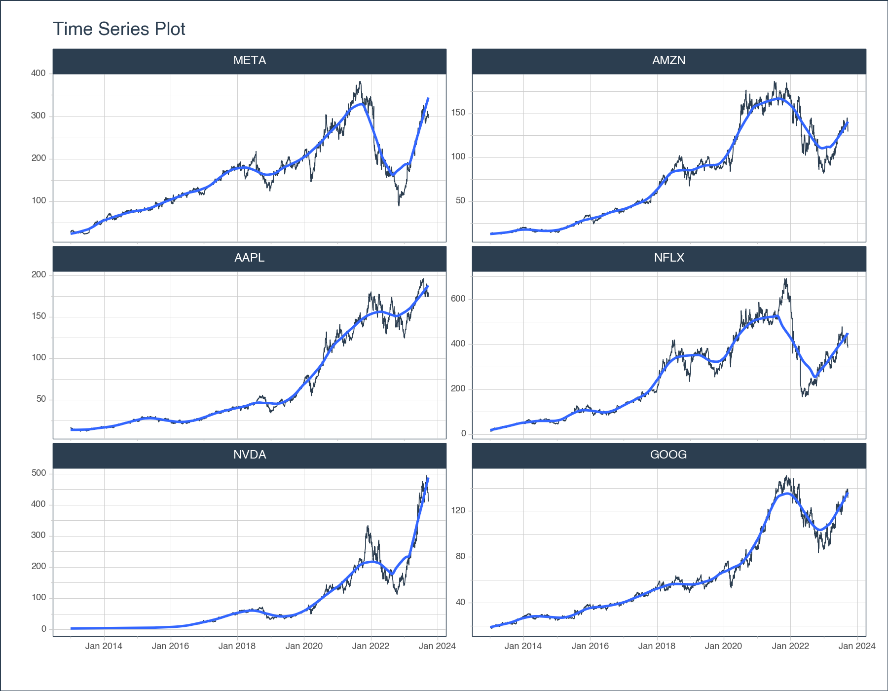
<Figure Size: (900 x 700)>Technical indicators are mathematical calculations based on the price, volume, or open interest of a security or contract used by traders who follow technical analysis. Technical analysis is a method of forecasting the direction of financial market prices through the study of past market data, primarily price, and volume. Technical indicators are most extensively used in the context of the stock market but are also used in other financial markets like forex, commodities, and cryptocurrencies.
Let’s see a few examples of technical indicators in pytimetk.
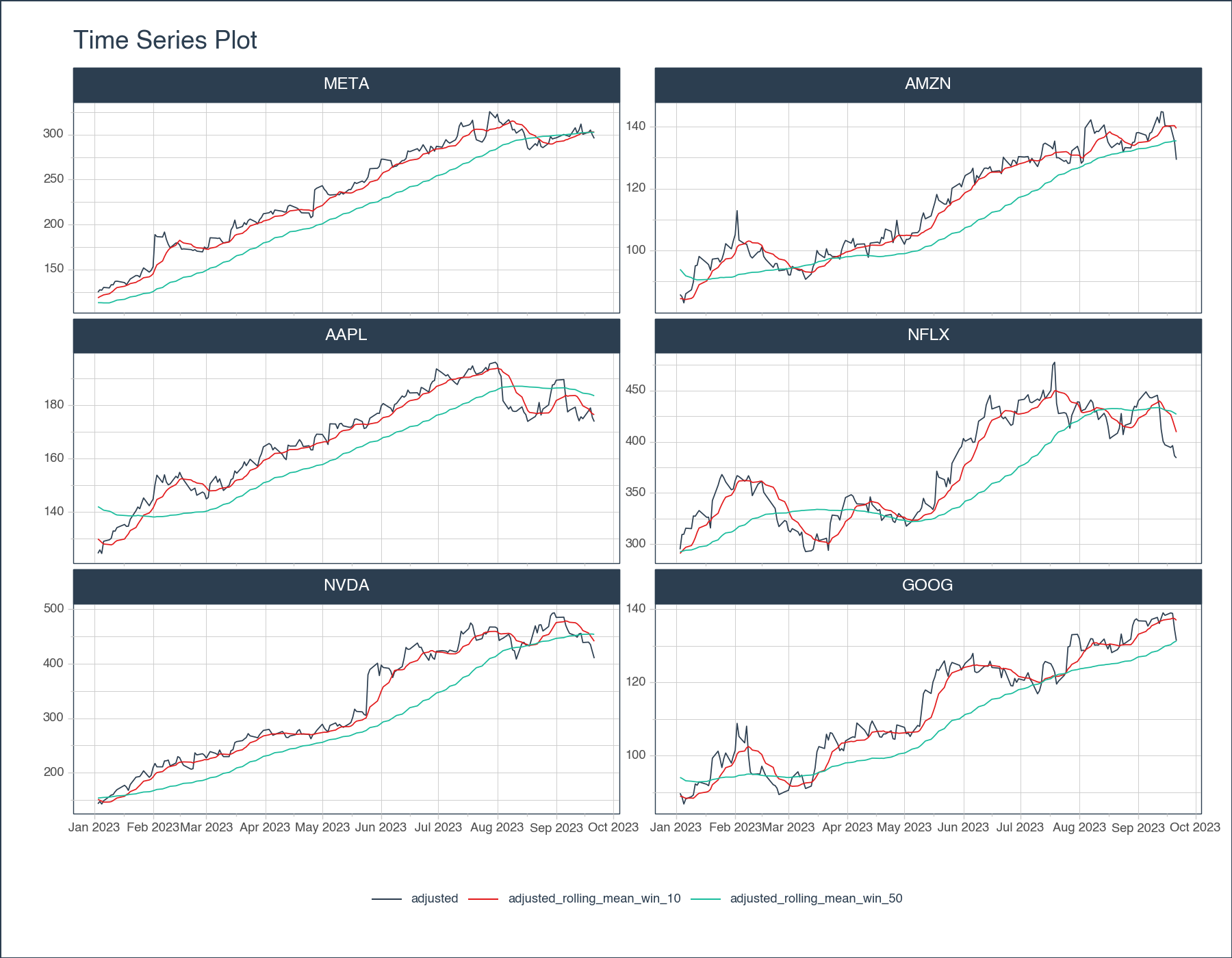
This code template can be used to make and visualize the 10-day and 50-Day moving average of a group of stock symbols. Click to expand the code.
# Add 2 moving averages (10-day and 50-Day)
sma_df = stocks_df[['symbol', 'date', 'adjusted']] \
.groupby('symbol') \
.augment_rolling(
date_column = 'date',
value_column = 'adjusted',
window = [10, 50],
window_func = ['mean'],
center = False,
threads = 1, # Change to -1 to use all available cores
)
# Visualize
(sma_df
# zoom in on dates
.query('date >= "2023-01-01"')
# Convert to long format
.melt(
id_vars = ['symbol', 'date'],
value_vars = ["adjusted", "adjusted_rolling_mean_win_10", "adjusted_rolling_mean_win_50"]
)
# Group on symbol and visualize
.groupby("symbol")
.plot_timeseries(
date_column = 'date',
value_column = 'value',
color_column = 'variable',
smooth = False,
facet_ncol = 2,
width = 900,
height = 700,
engine = "plotly"
)
)# Add 2 moving averages (10-day and 50-Day)
sma_df = stocks_df[['symbol', 'date', 'adjusted']] \
.groupby('symbol') \
.augment_rolling(
date_column = 'date',
value_column = 'adjusted',
window = [10, 50],
window_func = ['mean'],
center = False,
threads = 1, # Change to -1 to use all available cores
)
# Visualize
(sma_df
# zoom in on dates
.query('date >= "2023-01-01"')
# Convert to long format
.melt(
id_vars = ['symbol', 'date'],
value_vars = ["adjusted", "adjusted_rolling_mean_win_10", "adjusted_rolling_mean_win_50"]
)
# Group on symbol and visualize
.groupby("symbol")
.plot_timeseries(
date_column = 'date',
value_column = 'value',
color_column = 'variable',
smooth = False,
facet_ncol = 2,
width = 900,
height = 700,
engine = "plotnine"
)
)
<Figure Size: (900 x 700)>Bollinger Bands are a volatility indicator commonly used in financial trading. They consist of three lines:
Here’s how you can calculate and plot Bollinger Bands with pytimetk using this code template (click to expand):
# Bollinger Bands
bollinger_df = stocks_df[['symbol', 'date', 'adjusted']] \
.groupby('symbol') \
.augment_rolling(
date_column = 'date',
value_column = 'adjusted',
window = 20,
window_func = ['mean', 'std'],
center = False
) \
.assign(
upper_band = lambda x: x['adjusted_rolling_mean_win_20'] + 2*x['adjusted_rolling_std_win_20'],
lower_band = lambda x: x['adjusted_rolling_mean_win_20'] - 2*x['adjusted_rolling_std_win_20']
)
# Visualize
(bollinger_df
# zoom in on dates
.query('date >= "2023-01-01"')
# Convert to long format
.melt(
id_vars = ['symbol', 'date'],
value_vars = ["adjusted", "adjusted_rolling_mean_win_20", "upper_band", "lower_band"]
)
# Group on symbol and visualize
.groupby("symbol")
.plot_timeseries(
date_column = 'date',
value_column = 'value',
color_column = 'variable',
# Adjust colors for Bollinger Bands
color_palette =["#2C3E50", "#E31A1C", '#18BC9C', '#18BC9C'],
smooth = False,
facet_ncol = 2,
width = 900,
height = 700,
engine = "plotly"
)
)# Bollinger Bands
bollinger_df = stocks_df[['symbol', 'date', 'adjusted']] \
.groupby('symbol') \
.augment_rolling(
date_column = 'date',
value_column = 'adjusted',
window = 20,
window_func = ['mean', 'std'],
center = False
) \
.assign(
upper_band = lambda x: x['adjusted_rolling_mean_win_20'] + 2*x['adjusted_rolling_std_win_20'],
lower_band = lambda x: x['adjusted_rolling_mean_win_20'] - 2*x['adjusted_rolling_std_win_20']
)
# Visualize
(bollinger_df
# zoom in on dates
.query('date >= "2023-01-01"')
# Convert to long format
.melt(
id_vars = ['symbol', 'date'],
value_vars = ["adjusted", "adjusted_rolling_mean_win_20", "upper_band", "lower_band"]
)
# Group on symbol and visualize
.groupby("symbol")
.plot_timeseries(
date_column = 'date',
value_column = 'value',
color_column = 'variable',
# Adjust colors for Bollinger Bands
color_palette =["#2C3E50", "#E31A1C", '#18BC9C', '#18BC9C'],
smooth = False,
facet_ncol = 2,
width = 900,
height = 700,
engine = "plotnine"
)
)
<Figure Size: (900 x 700)>In finance, returns analysis involves evaluating the gains or losses made on an investment relative to the amount of money invested. It’s a critical aspect of investment and portfolio management:
tk.augment_rolling() to compute many rolling features at scale such as rolling mean, std, range (spread).tk.augment_rolling_apply() rolling calculations to Rolling Correlation and Rolling Regression (to make comparisons over time)Many traders compute descriptive statistics like mean, median, mode, skewness, kurtosis, and standard deviation to understand the central tendency, spread, and shape of the return distribution.
Use this code to get the pct_change() in wide format. Click expand to get the code.
returns_wide_df = stocks_df[['symbol', 'date', 'adjusted']] \
.pivot(index = 'date', columns = 'symbol', values = 'adjusted') \
.pct_change() \
.reset_index() \
[1:]
returns_wide_df| symbol | date | AAPL | AMZN | GOOG | META | NFLX | NVDA |
|---|---|---|---|---|---|---|---|
| 1 | 2013-01-03 | -0.012622 | 0.004547 | 0.000581 | -0.008214 | 0.049777 | 0.000786 |
| 2 | 2013-01-04 | -0.027854 | 0.002592 | 0.019760 | 0.035650 | -0.006315 | 0.032993 |
| 3 | 2013-01-07 | -0.005883 | 0.035925 | -0.004363 | 0.022949 | 0.033549 | -0.028897 |
| 4 | 2013-01-08 | 0.002691 | -0.007748 | -0.001974 | -0.012237 | -0.020565 | -0.021926 |
| 5 | 2013-01-09 | -0.015629 | -0.000113 | 0.006573 | 0.052650 | -0.012865 | -0.022418 |
| ... | ... | ... | ... | ... | ... | ... | ... |
| 2694 | 2023-09-15 | -0.004154 | -0.029920 | -0.004964 | -0.036603 | -0.008864 | -0.036879 |
| 2695 | 2023-09-18 | 0.016913 | -0.002920 | 0.004772 | 0.007459 | -0.006399 | 0.001503 |
| 2696 | 2023-09-19 | 0.006181 | -0.016788 | -0.000936 | 0.008329 | 0.004564 | -0.010144 |
| 2697 | 2023-09-20 | -0.019992 | -0.017002 | -0.030541 | -0.017701 | -0.024987 | -0.029435 |
| 2698 | 2023-09-21 | -0.008889 | -0.044053 | -0.023999 | -0.013148 | -0.005566 | -0.028931 |
2698 rows × 7 columns
Use this code to get standard statistics with the describe() method. Click expand to get the code.
returns_wide_df.describe()| symbol | AAPL | AMZN | GOOG | META | NFLX | NVDA |
|---|---|---|---|---|---|---|
| count | 2698.000000 | 2698.000000 | 2698.000000 | 2698.000000 | 2698.000000 | 2698.000000 |
| mean | 0.001030 | 0.001068 | 0.000885 | 0.001170 | 0.001689 | 0.002229 |
| std | 0.018036 | 0.020621 | 0.017267 | 0.024291 | 0.029683 | 0.028320 |
| min | -0.128647 | -0.140494 | -0.111008 | -0.263901 | -0.351166 | -0.187559 |
| 25% | -0.007410 | -0.008635 | -0.006900 | -0.009610 | -0.012071 | -0.010938 |
| 50% | 0.000892 | 0.001050 | 0.000700 | 0.001051 | 0.000544 | 0.001918 |
| 75% | 0.010324 | 0.011363 | 0.009053 | 0.012580 | 0.014678 | 0.015202 |
| max | 0.119808 | 0.141311 | 0.160524 | 0.296115 | 0.422235 | 0.298067 |
And run a correlation with corr(). Click expand to get the code.
corr_table_df = returns_wide_df.drop('date', axis=1).corr()
corr_table_df| symbol | AAPL | AMZN | GOOG | META | NFLX | NVDA |
|---|---|---|---|---|---|---|
| symbol | ||||||
| AAPL | 1.000000 | 0.497906 | 0.566452 | 0.479787 | 0.321694 | 0.526508 |
| AMZN | 0.497906 | 1.000000 | 0.628103 | 0.544481 | 0.475078 | 0.490234 |
| GOOG | 0.566452 | 0.628103 | 1.000000 | 0.595728 | 0.428470 | 0.531382 |
| META | 0.479787 | 0.544481 | 0.595728 | 1.000000 | 0.407417 | 0.450586 |
| NFLX | 0.321694 | 0.475078 | 0.428470 | 0.407417 | 1.000000 | 0.380153 |
| NVDA | 0.526508 | 0.490234 | 0.531382 | 0.450586 | 0.380153 | 1.000000 |
The problem is that the stock market is constantly changing. And these descriptive statistics aren’t representative of the most recent fluctuations. This is where pytimetk comes into play with rolling descriptive statistics.
tk.augment_rolling()Let’s compute and visualize the 90-day rolling statistics.
tk.augment_rolling()
help(tk.augment_rolling) to review additional helpful documentation.Use this code to get the date melt() into long format. Click expand to get the code.
returns_long_df = returns_wide_df \
.melt(id_vars='date', value_name='returns')
returns_long_df| date | symbol | returns | |
|---|---|---|---|
| 0 | 2013-01-03 | AAPL | -0.012622 |
| 1 | 2013-01-04 | AAPL | -0.027854 |
| 2 | 2013-01-07 | AAPL | -0.005883 |
| 3 | 2013-01-08 | AAPL | 0.002691 |
| 4 | 2013-01-09 | AAPL | -0.015629 |
| ... | ... | ... | ... |
| 16183 | 2023-09-15 | NVDA | -0.036879 |
| 16184 | 2023-09-18 | NVDA | 0.001503 |
| 16185 | 2023-09-19 | NVDA | -0.010144 |
| 16186 | 2023-09-20 | NVDA | -0.029435 |
| 16187 | 2023-09-21 | NVDA | -0.028931 |
16188 rows × 3 columns
Let’s add multiple columns of rolling statistics. Click to expand the code.
rolling_stats_df = returns_long_df \
.groupby('symbol') \
.augment_rolling(
date_column = 'date',
value_column = 'returns',
window = [90],
window_func = [
'mean',
'std',
'min',
('q25', lambda x: np.quantile(x, 0.25)),
'median',
('q75', lambda x: np.quantile(x, 0.75)),
'max'
],
threads = 1 # Change to -1 to use all threads
) \
.dropna()
rolling_stats_df| date | symbol | returns | returns_rolling_mean_win_90 | returns_rolling_std_win_90 | returns_rolling_min_win_90 | returns_rolling_q25_win_90 | returns_rolling_median_win_90 | returns_rolling_q75_win_90 | returns_rolling_max_win_90 | |
|---|---|---|---|---|---|---|---|---|---|---|
| 89 | 2013-05-13 | AAPL | 0.003908 | -0.001702 | 0.022233 | -0.123558 | -0.010533 | -0.001776 | 0.012187 | 0.041509 |
| 90 | 2013-05-14 | AAPL | -0.023926 | -0.001827 | 0.022327 | -0.123558 | -0.010533 | -0.001776 | 0.012187 | 0.041509 |
| 91 | 2013-05-15 | AAPL | -0.033817 | -0.001894 | 0.022414 | -0.123558 | -0.010533 | -0.001776 | 0.012187 | 0.041509 |
| 92 | 2013-05-16 | AAPL | 0.013361 | -0.001680 | 0.022467 | -0.123558 | -0.010533 | -0.001360 | 0.013120 | 0.041509 |
| 93 | 2013-05-17 | AAPL | -0.003037 | -0.001743 | 0.022462 | -0.123558 | -0.010533 | -0.001776 | 0.013120 | 0.041509 |
| ... | ... | ... | ... | ... | ... | ... | ... | ... | ... | ... |
| 16183 | 2023-09-15 | NVDA | -0.036879 | 0.005159 | 0.036070 | -0.056767 | -0.012587 | -0.000457 | 0.018480 | 0.243696 |
| 16184 | 2023-09-18 | NVDA | 0.001503 | 0.005396 | 0.035974 | -0.056767 | -0.011117 | 0.000177 | 0.018480 | 0.243696 |
| 16185 | 2023-09-19 | NVDA | -0.010144 | 0.005162 | 0.036006 | -0.056767 | -0.011117 | -0.000457 | 0.018480 | 0.243696 |
| 16186 | 2023-09-20 | NVDA | -0.029435 | 0.004953 | 0.036153 | -0.056767 | -0.012587 | -0.000457 | 0.018480 | 0.243696 |
| 16187 | 2023-09-21 | NVDA | -0.028931 | 0.004724 | 0.036303 | -0.056767 | -0.013166 | -0.000457 | 0.018480 | 0.243696 |
15654 rows × 10 columns
Finally, we can .melt() each of the rolling statistics for a Long Format Analysis. Click to expand the code.
rolling_stats_long_df = rolling_stats_df \
.melt(
id_vars = ["symbol", "date"],
var_name = "statistic_type"
)
rolling_stats_long_df| symbol | date | statistic_type | value | |
|---|---|---|---|---|
| 0 | AAPL | 2013-05-13 | returns | 0.003908 |
| 1 | AAPL | 2013-05-14 | returns | -0.023926 |
| 2 | AAPL | 2013-05-15 | returns | -0.033817 |
| 3 | AAPL | 2013-05-16 | returns | 0.013361 |
| 4 | AAPL | 2013-05-17 | returns | -0.003037 |
| ... | ... | ... | ... | ... |
| 125227 | NVDA | 2023-09-15 | returns_rolling_max_win_90 | 0.243696 |
| 125228 | NVDA | 2023-09-18 | returns_rolling_max_win_90 | 0.243696 |
| 125229 | NVDA | 2023-09-19 | returns_rolling_max_win_90 | 0.243696 |
| 125230 | NVDA | 2023-09-20 | returns_rolling_max_win_90 | 0.243696 |
| 125231 | NVDA | 2023-09-21 | returns_rolling_max_win_90 | 0.243696 |
125232 rows × 4 columns
With the data formatted properly we can evaluate the 90-Day Rolling Statistics using .plot_timeseries().
rolling_stats_long_df \
.groupby(['symbol', 'statistic_type']) \
.plot_timeseries(
date_column = 'date',
value_column = 'value',
facet_ncol = 6,
width = 1500,
height = 1000,
title = "90-Day Rolling Statistics"
)