Code
import pytimetk as tk
import pandas as pdAnomalize: Breakdown, identify, and clean anomalies in 1 easy step
Anomalies, often called outliers, are data points that deviate significantly from the general trend or pattern in the data. In the context of time series, they can appear as sudden spikes, drops, or any abrupt change in a sequence of values.
Anomaly detection for time series is a technique used to identify unusual patterns that do not conform to expected behavior. It is especially relevant for sequential data (like stock prices, sensor data, sales data, etc.) where the temporal aspect is crucial. Anomalies can identify important events or be the cause of noise that can hinder forecasting performance.
tk.anomalize(): A single function that integrates time series decomposition, anomaly identification (scoring), and outlier cleaning.tk.plot_anomalies_decomp(): The first step towards identifying if your anomalization is detecting outliers to your needs.tk.plot_anomalies(): The second step to visualize the anomalies.tk.plot_anomalies_cleaned(): Compare the data with anomalies removed (before and after)This applied tutorial is separated into 2 parts:
Load these libraries to get started.
import pytimetk as tk
import pandas as pdNext, get some data. We’ll use the wikipedia_traffic_daily data set that comes with anomalize. This contains data on various websites
We’ll glimpse() the data to get a sense of what we are working with.
df = tk.load_dataset("wikipedia_traffic_daily", parse_dates = ['date'])

df.glimpse()
<class 'pandas.core.frame.DataFrame'>: 5500 rows of 3 columns
Page: object ['Death_of_Freddie_Gray_en.wikipedia.org_mobil ...
date: datetime64[ns] [Timestamp('2015-07-01 00:00:00'), Timestamp(' ...
value: int64 [791, 704, 903, 732, 558, 504, 543, 1156, 1196 ...We can see that the wikipedia_traffic_daily dataset has:
datevalue columnPage columnNext, plot the time series.
df \
    .groupby('Page') \
    .plot_timeseries(
        date_column = "date",
        value_column = "value",
        facet_ncol = 2,
        width = 800,
        height = 800,
        engine = 'plotly'
)df \
.groupby('Page') \
.plot_timeseries(
date_column = "date",
value_column = "value",
facet_ncol = 2,
width = 800,
height = 800,
engine = 'plotnine'
)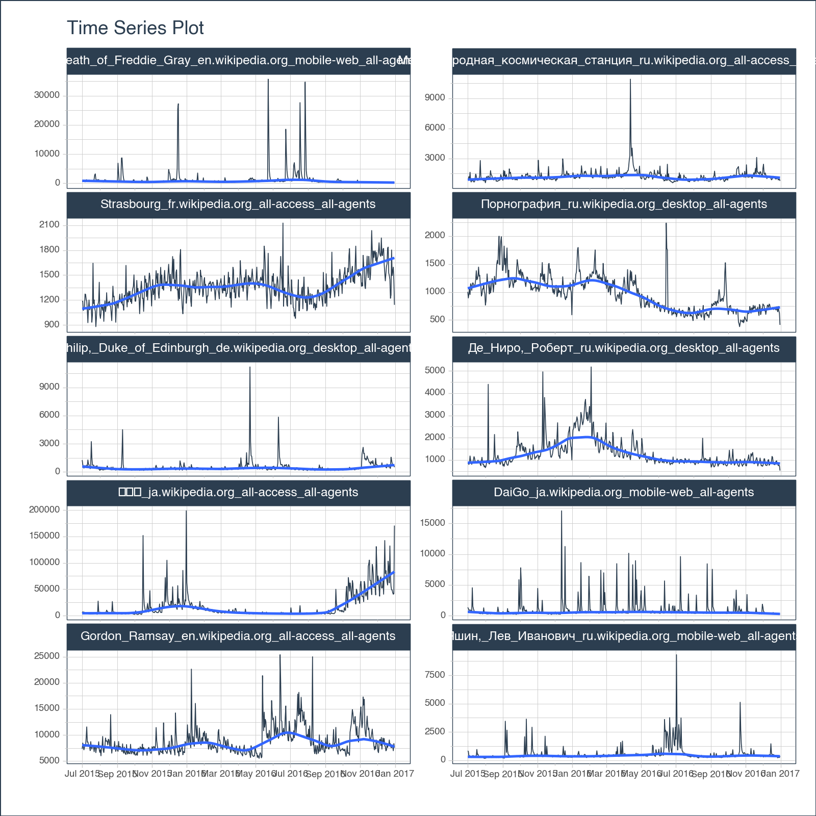
<Figure Size: (800 x 800)>We can see there are some spikes, but are these anomalies? Let’s use anomalize() to detect.
The anomalize() function is a feature rich tool for performing anomaly detection. Anomalize is group-aware, so we can use this as part of a normal pandas groupby chain. In one easy step:
anomalize_df = df \
    .groupby('Page', sort = False) \
    .anomalize(
        date_column = "date",
        value_column = "value",
    )

anomalize_df.glimpse()
<class 'pandas.core.frame.DataFrame'>: 5500 rows of 13 columns
Page: object ['Death_of_Freddie_Gray_en.wikiped ...
date: datetime64[ns] [Timestamp('2015-07-01 00:00:00'), ...
observed: int64 [791, 704, 903, 732, 558, 504, 543 ...
seasonal: float64 [206.78723511550484, 4.04332698700 ...
seasadj: float64 [584.2127648844952, 699.9566730129 ...
trend: float64 [729.0301895900458, 726.0497757616 ...
remainder: float64 [-144.8174247055506, -26.093102748 ...
anomaly: object ['No', 'No', 'No', 'No', 'No', 'No ...
anomaly_score: float64 [266.9421236324138, 148.2178016755 ...
anomaly_direction: int64 [0, 0, 0, 0, 0, 0, 0, 0, 0, 0, 0, ...
recomposed_l1: float64 [266.05095141435606, 60.3266294574 ...
recomposed_l2: float64 [1849.8332958504716, 1644.10897389 ...
observed_clean: float64 [791.0, 704.0, 903.0, 732.0, 558.0 ...anomalize() function returns:
observed, seasonal, seasadj, trend, and remainder. The objective is to remove trend and seasonality such that the remainder is stationary and representative of normal variation and anomalous variations.anomaly, anomaly_score, anomaly_direction. These identify the anomaly decision (Yes/No), score the anomaly as a distance from the centerline, and label the direction (-1 (down), zero (not anomalous), +1 (up)).recomposed_l1 and recomposed_l2. Think of these as the lower and upper bands. Any observed data that is below l1 or above l2 is anomalous.observed_clean. Cleaned data is automatically provided, which has the outliers replaced with data that is within the recomposed l1/l2 boundaries. With that said, you should always first seek to understand why data is being considered anomalous before simply removing outliers and using the cleaned data.The most important aspect is that this data is ready to be visualized, inspected, and modifications can then be made to address any tweaks you would like to make.
The first step in my normal process is to analyze the seasonal decomposition. I want to see what the remainders look like, and make sure that the trend and seasonality are being removed such that the remainder is centered around zero.
We’ll cover how to tweak the nobs of anomalize() in the next section aptly named “How to tweak the nobs on anomalize”.
anomalize_df \
    .groupby("Page") \
    .plot_anomalies_decomp(
        date_column = "date",
        width = 1800,
        height = 1000,
        engine = 'plotly'
)anomalize_df \
.groupby("Page") \
.plot_anomalies_decomp(
date_column = "date",
width = 1800,
height = 1000,
x_axis_date_labels = "%Y",
engine = 'plotnine'
)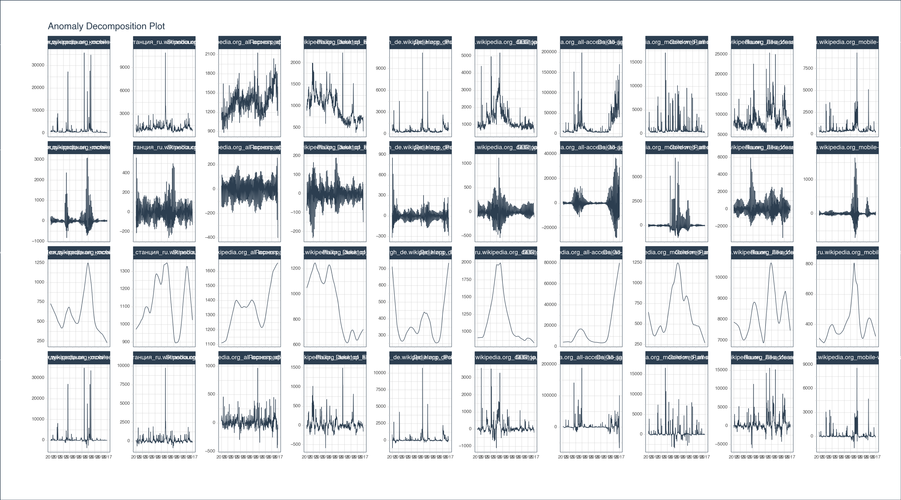
<Figure Size: (1800 x 1000)>Once I’m satisfied with the remainders, my next step is to visualize the anomalies. Here I’m looking to see if I need to grow or shrink the remainder l1 and l2 bands, which classify anomalies.
anomalize_df \
    .groupby("Page") \
    .plot_anomalies(
        date_column = "date",
        facet_ncol = 2,
        width = 1000,
        height = 1000,
)anomalize_df \
.groupby("Page") \
.plot_anomalies(
date_column = "date",
facet_ncol = 2,
width = 1000,
height = 1000,
x_axis_date_labels = "%Y",
engine = 'plotnine'
)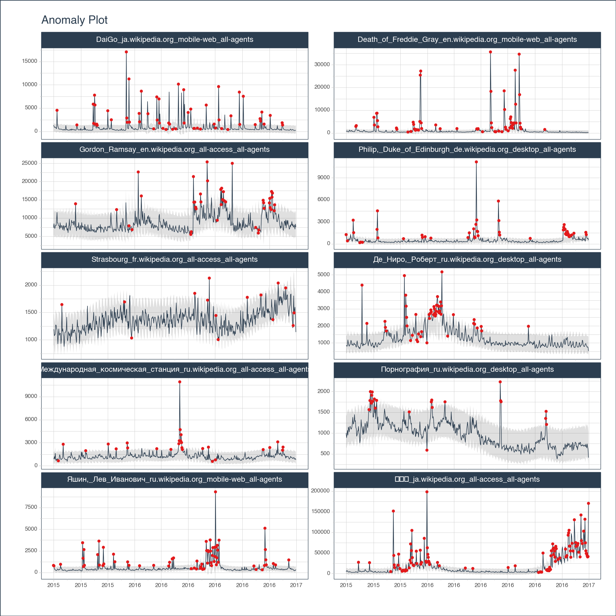
<Figure Size: (1000 x 1000)>There are pros and cons to cleaning anomalies. I’ll leave that discussion for another time. But, should you be interested in seeing what your data looks like cleaned (with outliers removed), this plot will help you compare before and after.
anomalize_df \
    .groupby("Page") \
    .plot_anomalies_cleaned(
        date_column = "date",
        facet_ncol = 2,
        width = 1000,
        height = 1000,
        engine = "plotly"
)anomalize_df \
.groupby("Page") \
.plot_anomalies_cleaned(
date_column = "date",
facet_ncol = 2,
width = 1000,
height = 1000,
x_axis_date_labels = "%Y",
engine = 'plotnine'
)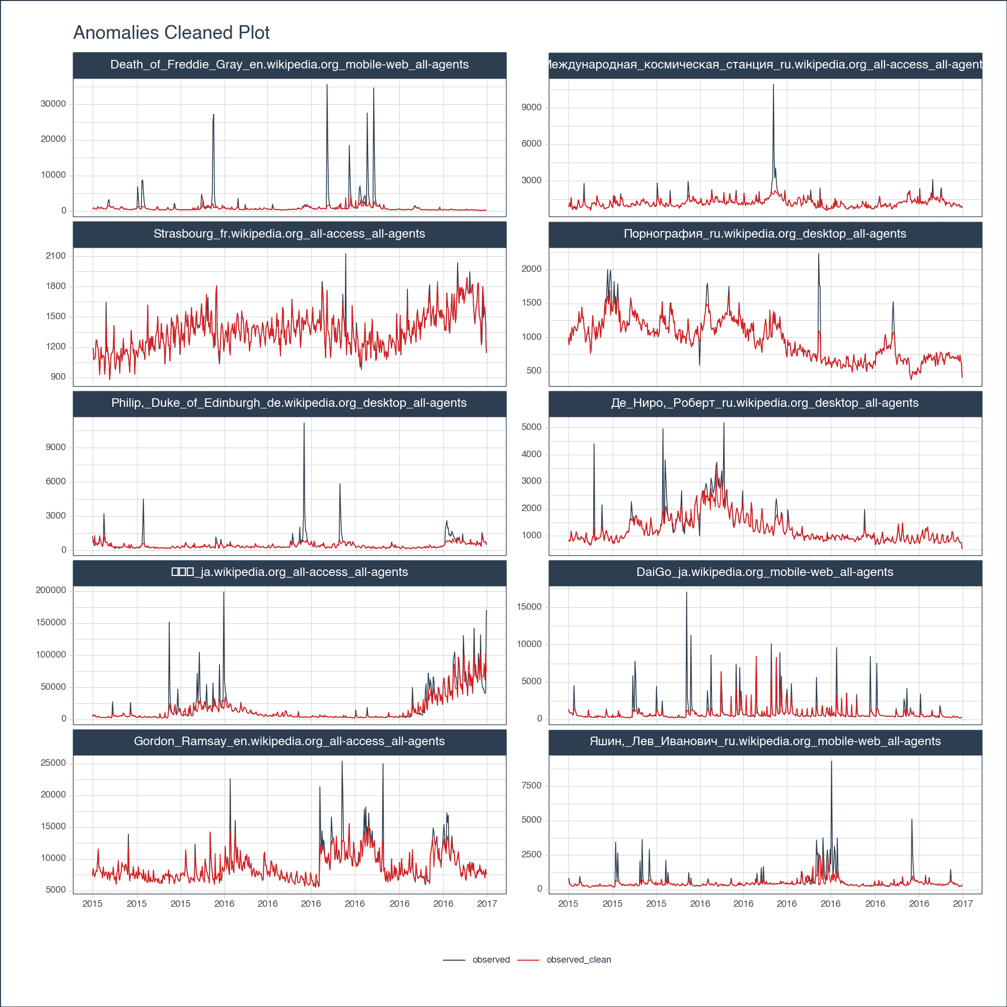
<Figure Size: (1000 x 1000)>anomalizeComing soon…
We are in the early stages of development. But it’s obvious the potential for pytimetk now in Python. 🐍