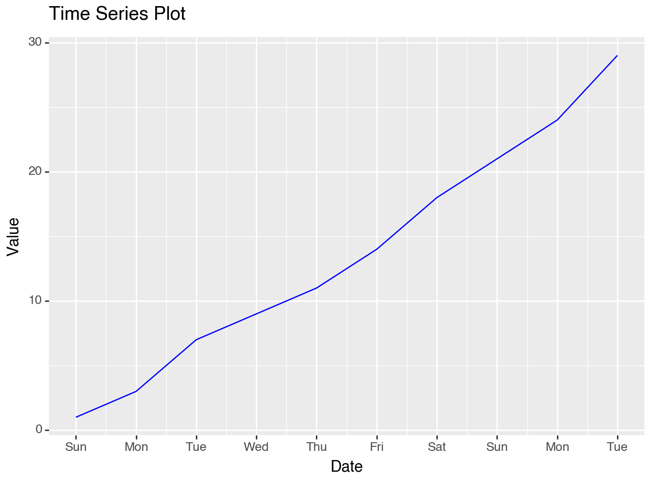
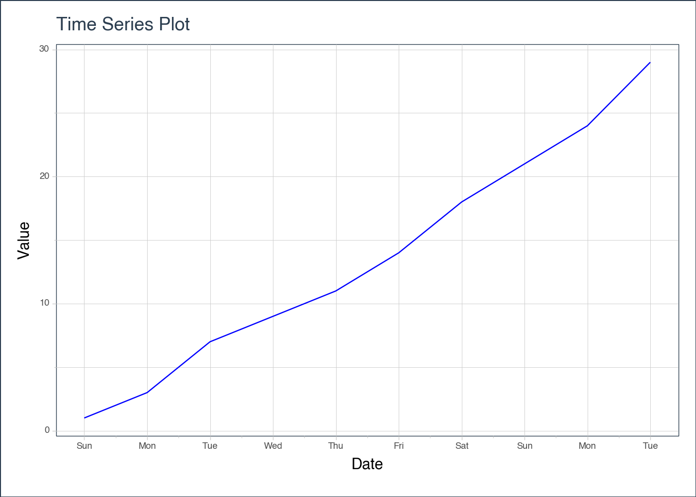
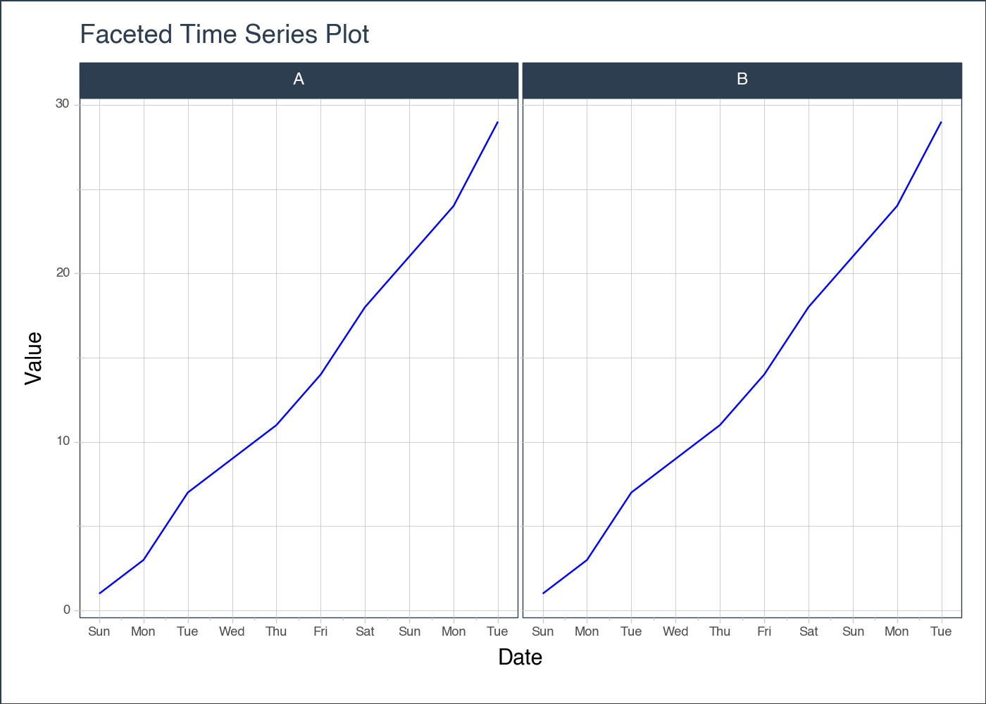
Returns a plotnine theme with timetk styles applied, allowing for customization of the appearance of plots in Python.
Parameters
Name
Type
Description
Default
base_size
int
The base_size parameter determines the base font size for the theme. It is set to 11 by default, but you can change it to any desired value.
11
base_family
list
The base_family parameter is a list of font families that will be used as the base font for the theme. The default value is ['Arial', 'Helvetica', 'sans-serif'], which means that the theme will use Arial font if available, otherwise it will try Helvetica, and if that is not available either, it will use the generic sans-serif font.
['Arial', 'Helvetica', 'sans-serif']
dpi
int
The dpi parameter stands for dots per inch and determines the resolution of the plot. It specifies the number of pixels per inch in the output image. Higher dpi values result in higher resolution images.
100
width
int
The width parameter is used to specify the width of the plot in pixels at dpi. It determines the horizontal size of the plot. The default value is 700 pixels.
700
height
int
The height parameter is used to specify the height of the plot in inches. It is an optional parameter, so if you don’t provide a value for it, the default height will be 5 inches (500 pixels).
500
Returns
Name
Type
Description
A theme object that can be used to customize the appearance of plots in
Python. The theme object contains various elements such as line, rect, axis, panel, legend, strip, and plot, each with their own set of properties that can be customized.