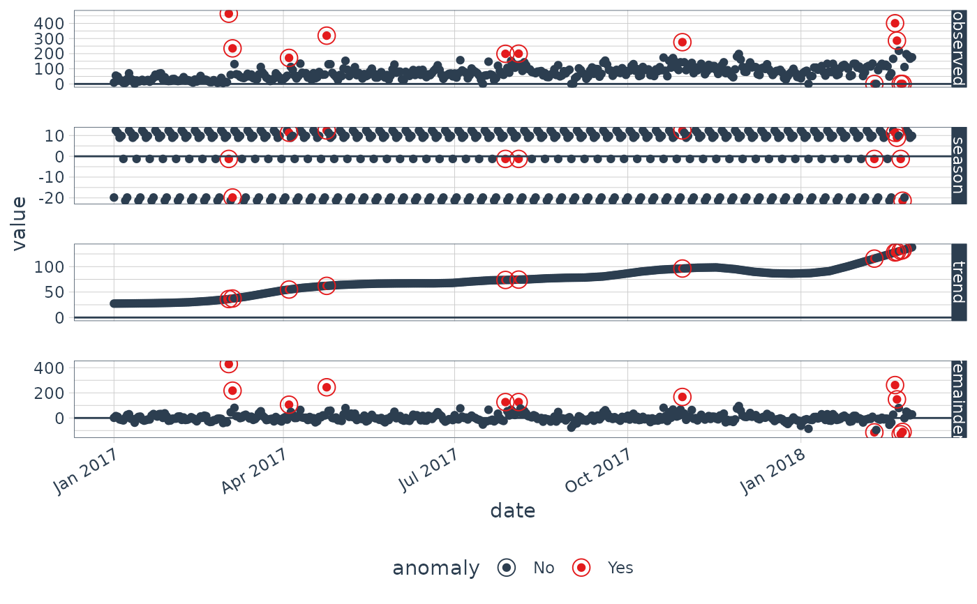
Visualize the time series decomposition with anomalies shown
Source:R/plot_anomaly_decomposition.R
plot_anomaly_decomposition.RdVisualize the time series decomposition with anomalies shown
Usage
plot_anomaly_decomposition(
  data,
  ncol = 1,
  color_no = "#2c3e50",
  color_yes = "#e31a1c",
  alpha_dots = 1,
  alpha_circles = 1,
  size_dots = 1.5,
  size_circles = 4,
  strip.position = "right"
)
Arguments
- data
A
tibbleortbl_timeobject.- ncol
Number of columns to display. Set to 1 for single column by default.
- color_no
Color for non-anomalous data.
- color_yes
Color for anomalous data.
- alpha_dots
Controls the transparency of the dots. Reduce when too many dots on the screen.
- alpha_circles
Controls the transparency of the circles that identify anomalies.
- size_dots
Controls the size of the dots.
- size_circles
Controls the size of the circles that identify anomalies.
- strip.position
Controls the placement of the strip that identifies the time series decomposition components.
Details
The first step in reviewing the anomaly detection process is to evaluate
a single times series to observe how the algorithm is selecting anomalies.
The plot_anomaly_decomposition() function is used to gain
an understanding as to whether or not the method is detecting anomalies correctly and
whether or not parameters such as decomposition method, anomalize method,
alpha, frequency, and so on should be adjusted.